Accordion (Lite)
Purpose
A component for content aggregation with default collapse behavior.
Front-End
Collapsed View

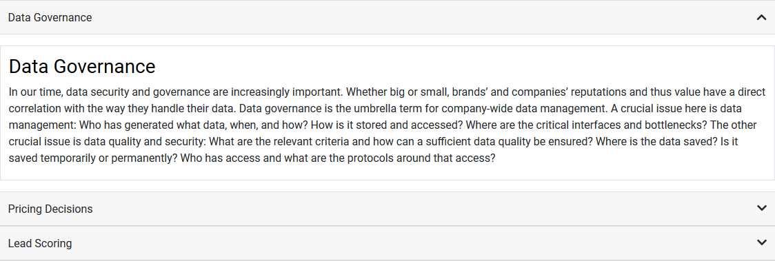
Expanded first Accordion Item View

Back-End (Dialog)
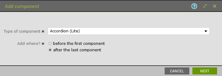
To add a component, select an area first and click Add component in the action bar. Select Accordion (Lite) as your component type and choose whether to add it at the top or bottom of selected area.

Add a title to your accordion.

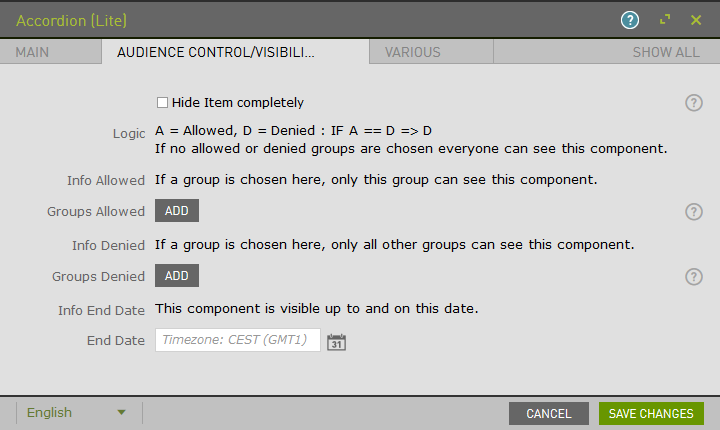
The Audience Control/Visibility (ACL) tab is used to determine which Groups are allowed to see this component. Adding ACLs at the parent level will affect the parent component. ACL is also available for content within Accordion items.

Once saved, the component that has been added to the page will remain selected for further editorial actions. Select Accordion Items (Lite) and click New Accordion Items (Lite) Component to add the individual slider items.

Add a title to your accordion item.

Upon saving, the page will reload and display the slider and item.

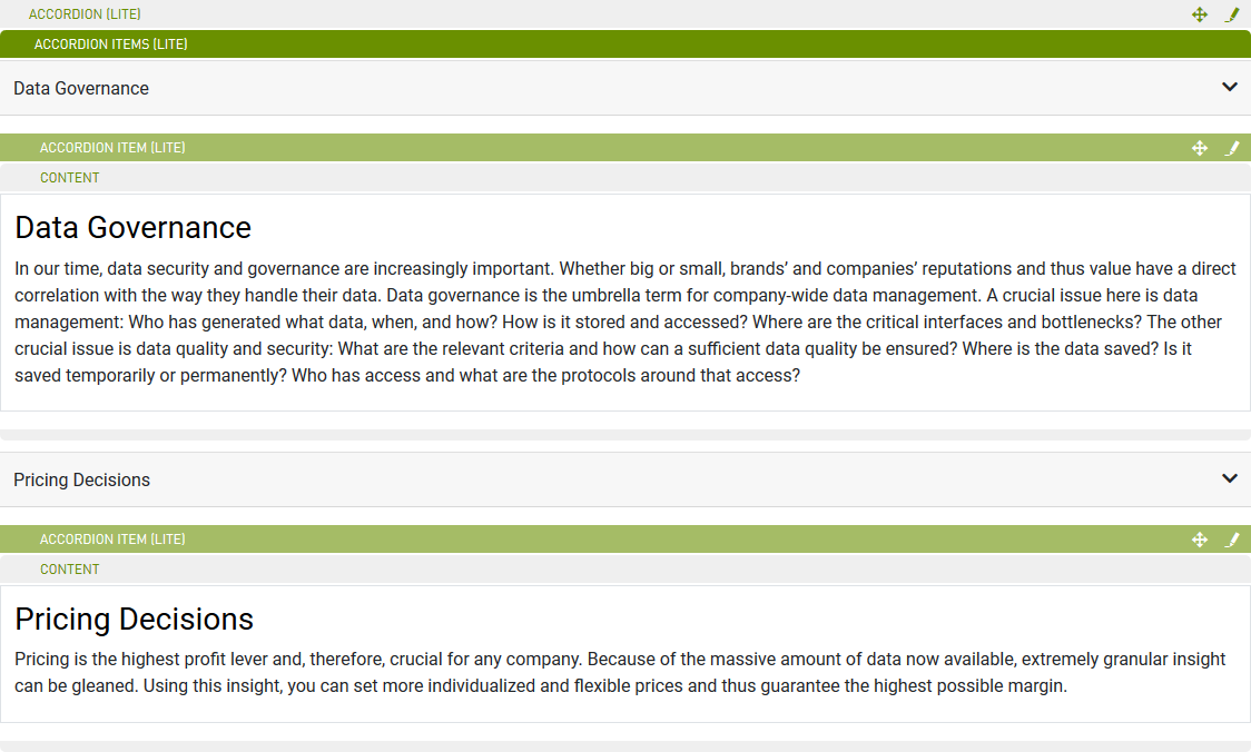
Click on the newly created accordion item to enable content options. Select Content and click New Content Component to add sub components.
Example: Text/Image component added to several Accordion Items.
