Asset Block (Lite)
Purpose
An asset and/or template container with options.
Front-End
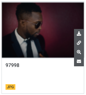
Example: Small asset block with hover effect
Example: Medium asset block
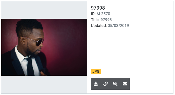
Example: Large asset block

Back-End (Dialog)
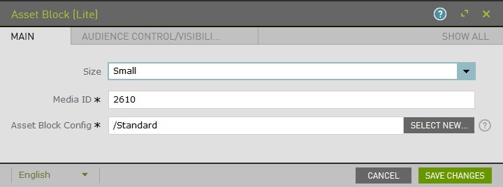
To add a component, select an area first and click Add component in the action bar. Select Asset Block (Lite) as your component type and choose whether to add it at the top or bottom of selected area.
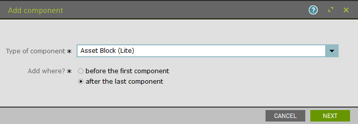
Add asset block size:
- Small = 1/4 of large screen width
- Medium = 1/2 of large screen width
- Large = full large screen width
Enter media ID of asset to load. Refer to Asset Block Config section of the docs for the required field of the Main tab.
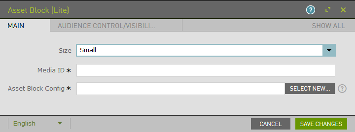
Example:
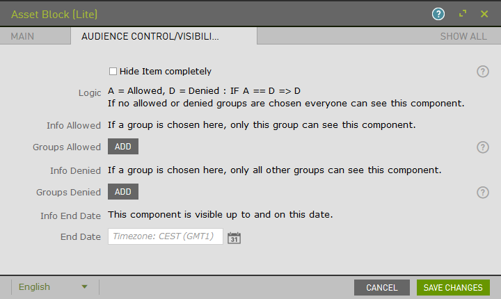
The Audience Control/Visibility (ACL) tab is used to determine which Groups are allowed to see this component.
Upon saving, the page will reload and display the component.
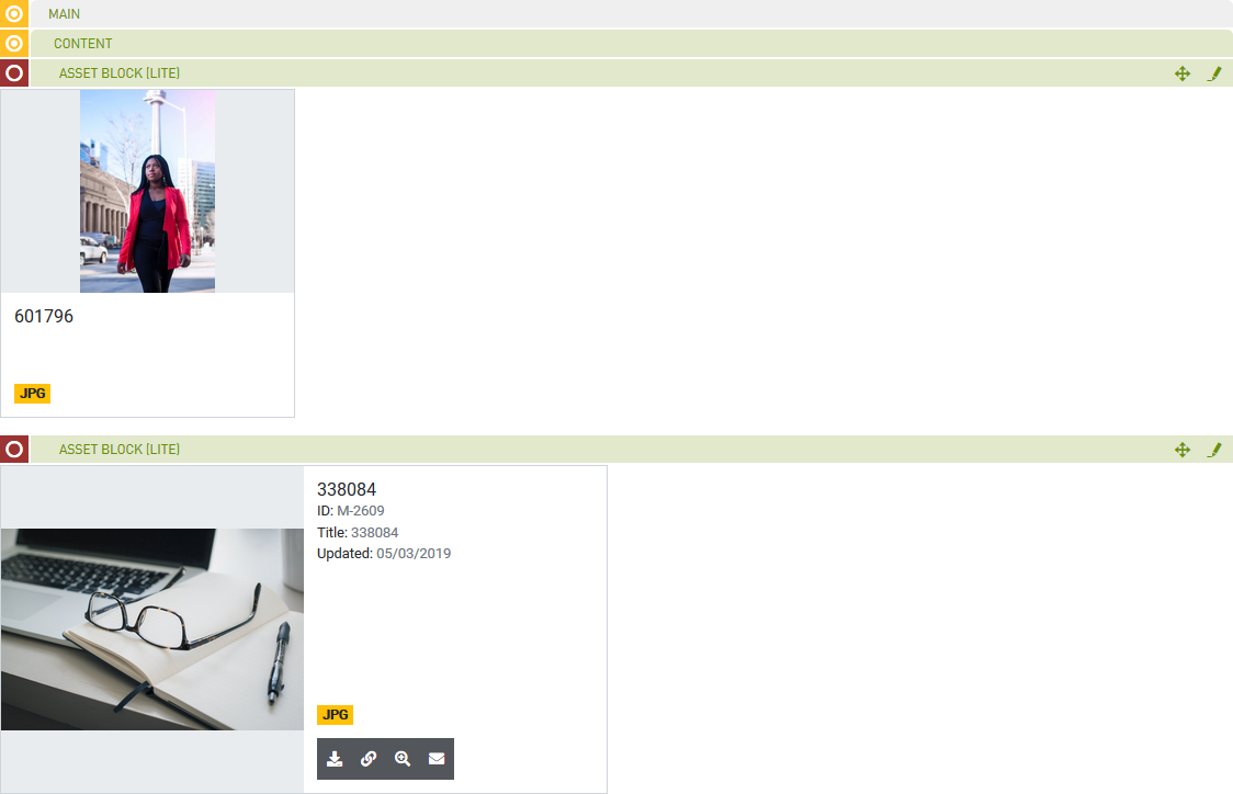
Note: Refer to the Row (Lite) component to add multiple Asset Blocks to a single row. If a teaser is not within a row, by default it will be the only component in that row.