Slider (Lite)
Purpose
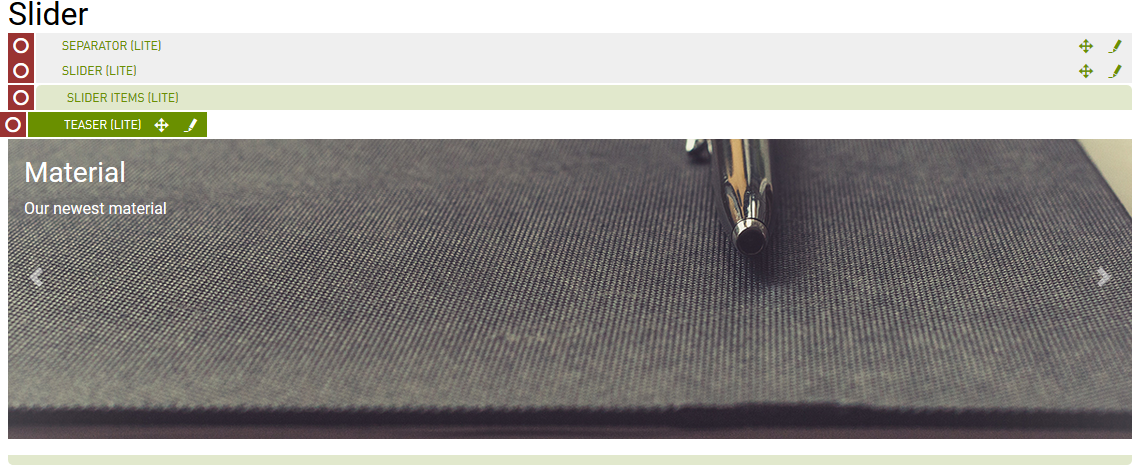
A slideshow component for cycling through elements - images or slides of text. Elements may be static or function as links.
Front-End

Back-End (Dialog)
To add a component, select an area first and click Add component in the action bar. Select Slider (Lite) as your component type and choose whether to add it at the top or bottom of selected area.
The parent dialog offers the following options:
- Display Indicators: check to add indicators, alongside the controls.
- Slide duration: adds time spent on each slider in seconds before next slide comes in.

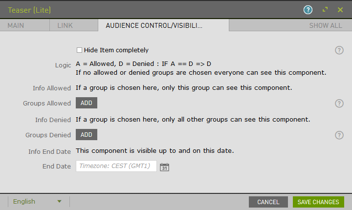
The Audience Control/Visibility (ACL) tab is used to determine which Groups are allowed to see this component. Adding ACLs at the parent level will affect the parent component. ACL is also available at the Slider Item level.
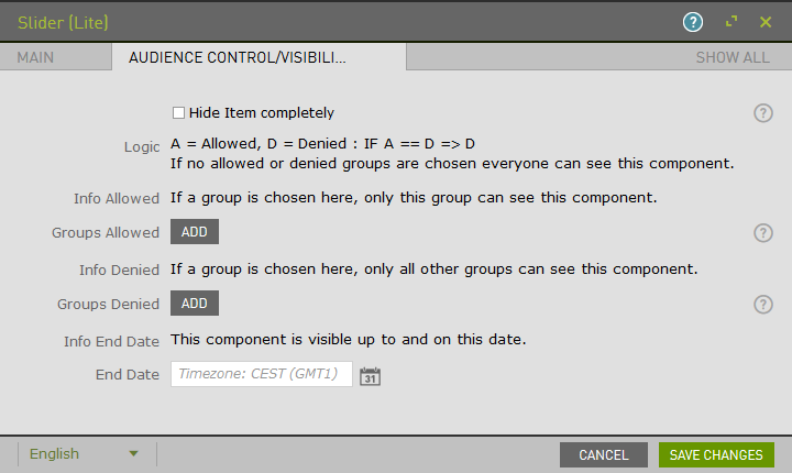
Once saved, the component that has been added to the page will remain selected for further editorial actions. Select Slider Items (Lite) and click New Slider Items (Lite) Component to add the individual slider items.

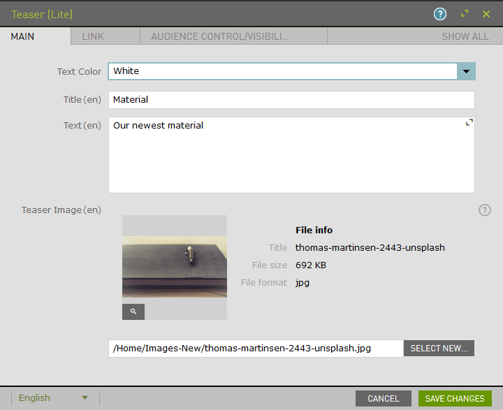
Within the child dialog, add Text and Image to your item.

Example:
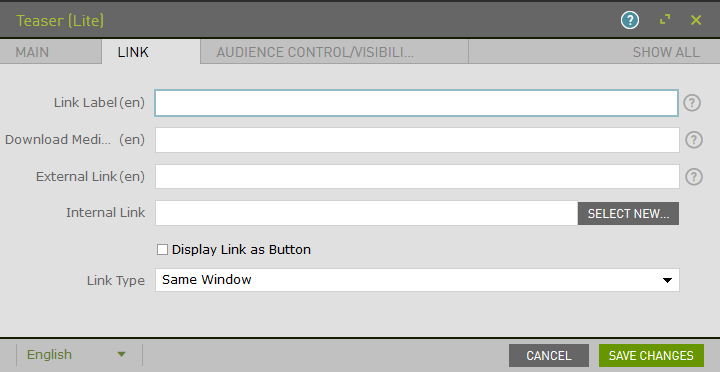
Within the child dialog, enable the Link option and type.
Add ACL to the child.
Upon saving, the page will reload and display the component.
