Teaser (Lite)
Purpose
Lightweight, flexible component for showcasing hero unit style image and acts as link.
Front-End
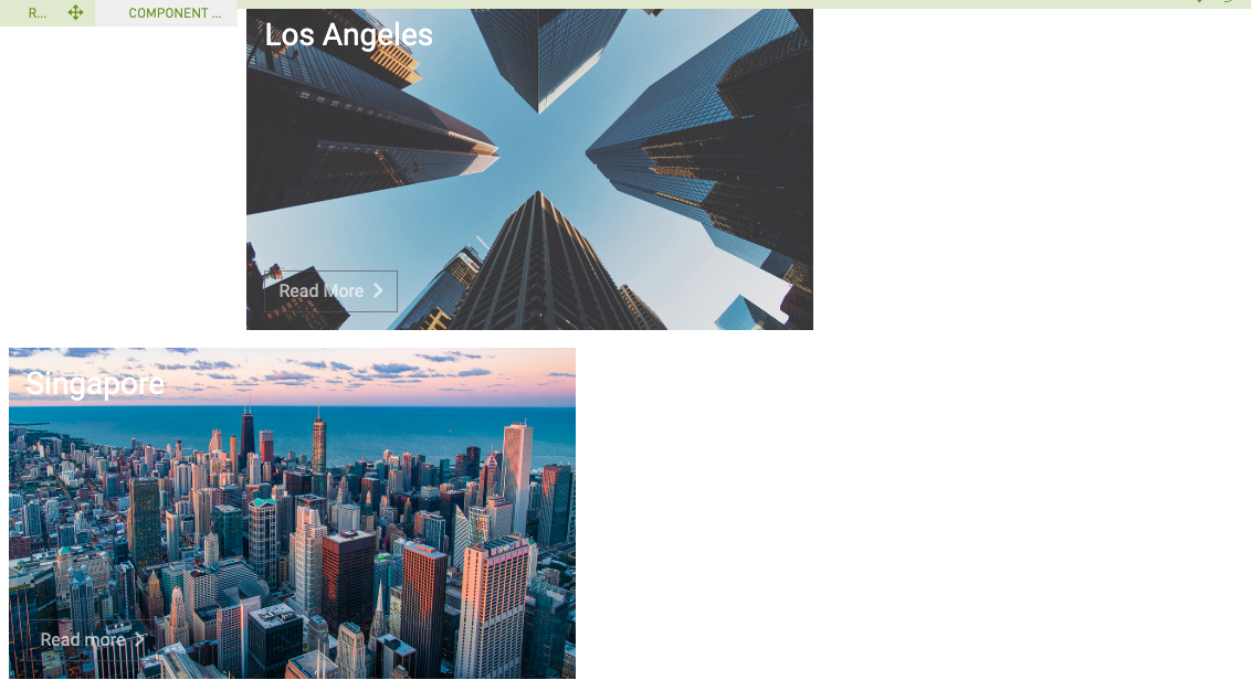
Example: Small teaser with white text and link

Example: Small teaser with white text and link (without link label)

Example: Medium teaser with blue text

Example: Large teaser with gray text

Back-End (Dialog)
To add a component, select an area first and click Add component in the action bar. Select Teaser (Lite) as your component type and choose whether to add it at the top or bottom of selected area.
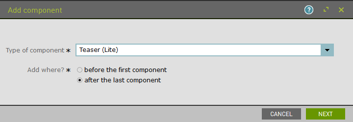
Add teaser size:
- Small = 1/4 of large screen width
- Medium = 1/2 of large screen width
- Large = full large screen width
Style and edit text as well as add image.
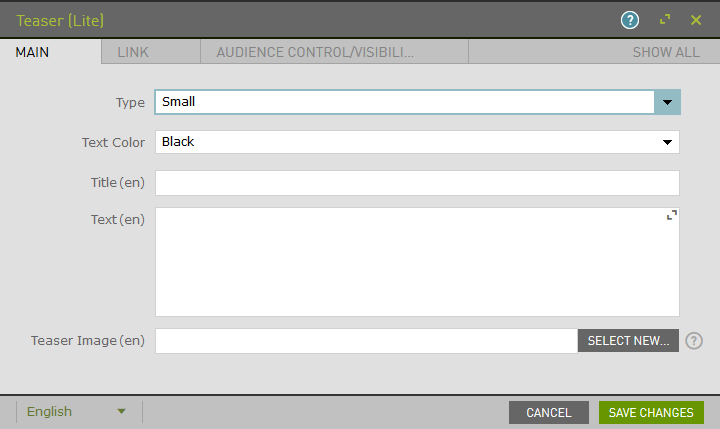
Example:
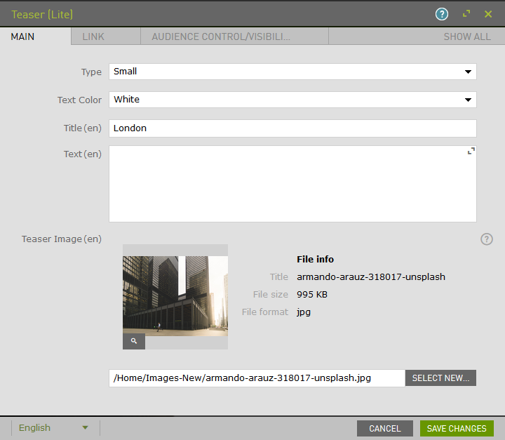
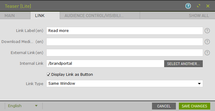
Using the Link tab, add a label, type, and define one of the following:
- Single Media ID
- External Link or URL
- Link to another internal page
Link will display as text with an arrow or as button.
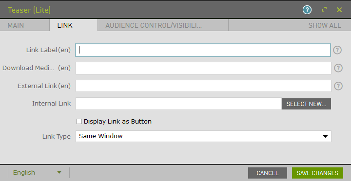
Example:
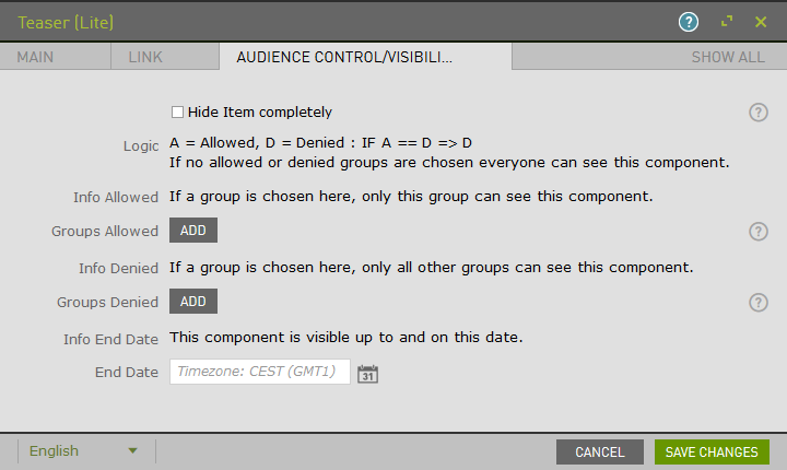
The Audience Control/Visibility (ACL) tab is used to determine which Groups are allowed to see this component.
Upon saving, the page will reload and display the component.
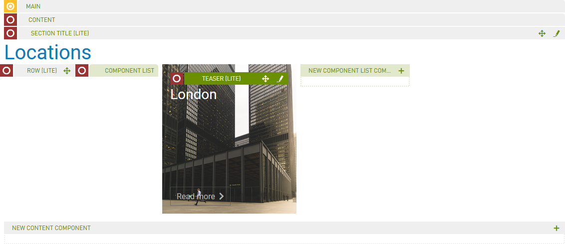
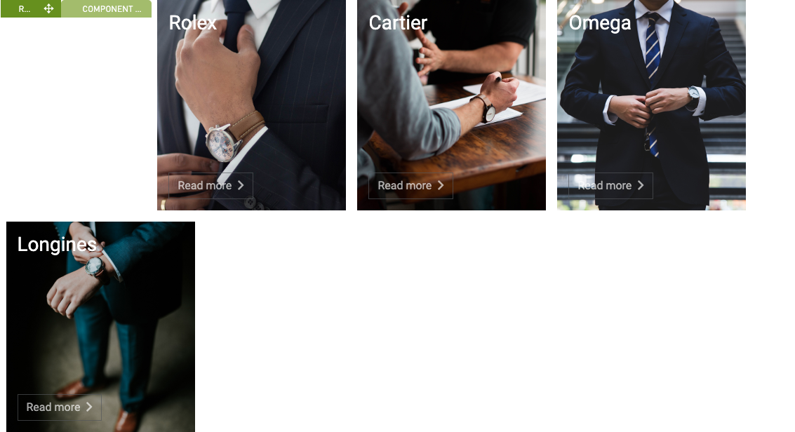
Note: Refer to the Row (Lite) component to add multiple Teasers to a single row. If a teaser is not within a row, by default it will be the only component in that row.
Example: Four small teasers in a row
Example: Two medium teasers in a row
